
Five Easy Pieces: Douglas Hill

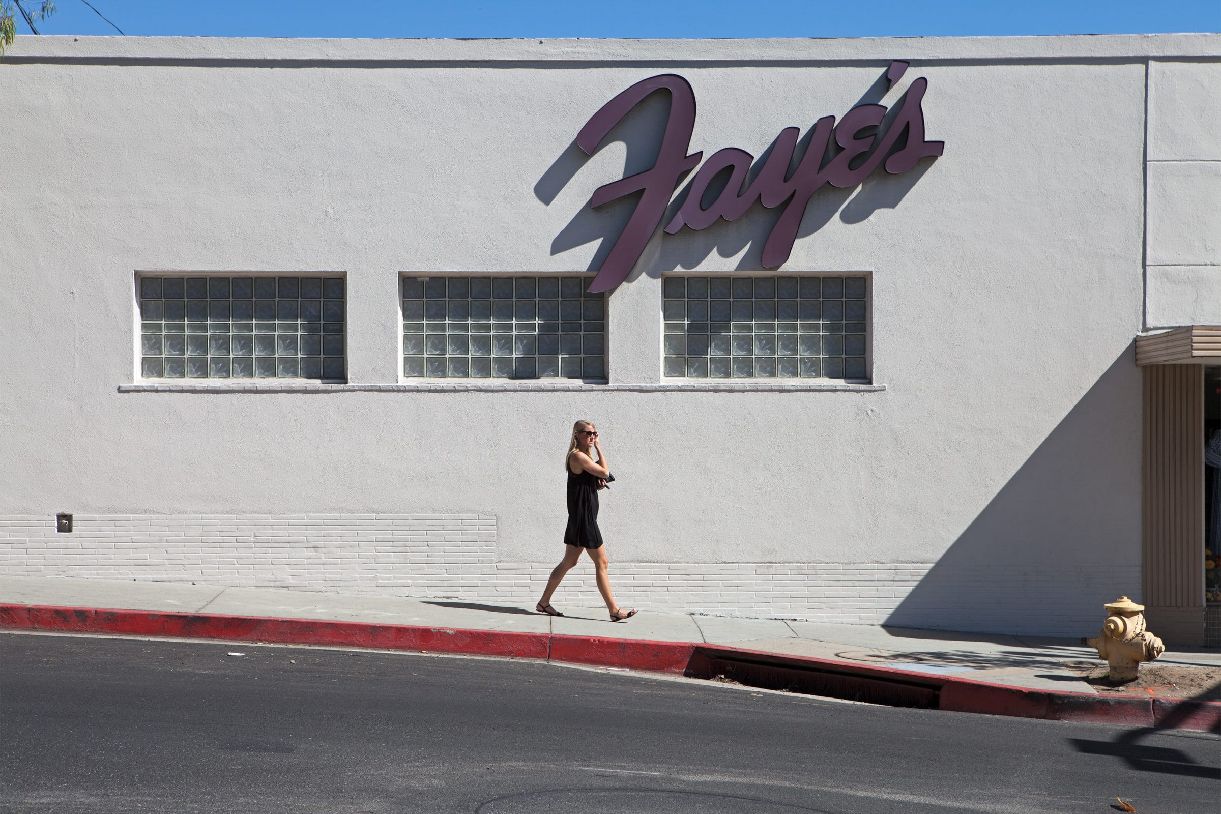
Douglas Hill, Clothing Store (Faye’s), Ocean View Blvd, Montrose, 2017
Douglas (Doug) Hill is not a street photographer. Instead, he is a photographer of streets.
Doug has been working in Los Angeles since 1969, trained at UCLA and CalArts, teaching at UCLA Extension since 1995. His fine art prints hang in the Getty, the Huntington, the Library of Congress, the Smithsonian American Art Museum. He was a Critical Mass finalist in 2023. None of that shows up in the photographs themselves. What shows up is a man who knows exactly where to stand. His photos are exacting, precise; you feel the attention given to both the subject and the frame.
Photo one (above) — Faye’s, Los Angeles, color photograph.
Take the photograph outside the clothing store, Faye’s. A woman in a black sundress, sunglasses, phone at her ear, mid-stride under a cursive sign that reads Faye’s against a white, maybe grey, stucco wall. Below the sign, three tall windows made of glass block, thick, rigid glass bricks set in a grid, the kind that lets in light but no view. A band of white brick runs along the base of the wall. The curb is painted red, no stopping, and it draws a line toward a storm drain cut into the corner. A yellow fire hydrant anchors the bottom right. And on the far right, a hard diagonal shadow, cast by something outside the frame, cuts a sharp triangle across the wall.
That shadow is the whole photograph. A cast shadow is supposed to tell your eye about depth, about a light source at an angle, about a wall receding into space. This one does the opposite. The wall is flat and evenly lit, and the shadow’s edge is so sharp it reads as a shape sitting on the surface of the print rather than a shadow falling through space. The photograph fights its own illusion of depth, using real sun and real hard edges to flatten itself back into a design of rectangles and triangles: the glass block grid, the red curb line, the coursing of the brick. And yet nothing in the frame is arranged. The sign is a real sign over a real business. The woman is a passerby, unposed, unaware of the camera. That’s the tension. The photograph insists on being documentary and insists just as hard on being a flat, designed arrangement of shapes, and it will not let you fully accept either reading.
Doug can talk about paintings the way most photographers talk about photographs. He can get your reference to Larry Poons, and tell you, “I think you mean Jules Olitski” and get what you mean when you relate the painter to his photos. Olitski would lay unstretched canvas out on the floor and spray colors into each other across the whole surface, then decide the actual size and shape of the painting afterward, cropping it out of the larger sprayed field. Starting in 1966 he began working the framing edge directly, brushing a line of gel-thickened paint along the bottom and sides, so the border of the canvas carries real density while the center stays soft, misty, sprayed thin. The edge isn’t where the painting runs out. It’s where the painting is doing the most. So it goes with Doug’s photos. Look to the edge.
That’s the same principle a Japanese print runs on, and it’s why the Impressionists who collected them, Degas most of all, picked it up directly. A woodblock print rarely centers its subject and lets the frame’s edges go quiet. It crops a dancer, a bridge, a branch, right at the boundary, so the eye reads the edge as the site of the action rather than its limit. Degas did the same thing on canvas after he started collecting those prints, a dancer’s leg or a hand cut clean off by the frame, the scene composed as if caught rather than arranged. Faye’s shadow works exactly that way. It doesn’t sit quietly in the middle of the frame and let the border go slack. It runs its full sharp weight straight out to the edge, and that edge is where the photograph is loudest. I think about this visual habit when I press the shutter. Not Olitski or Degas by name, so much as the habit they left in me, of checking whether the edge of the frame is carrying its share of the picture or just letting it end. In Doug’s photos, I see the same his skill with the edge.
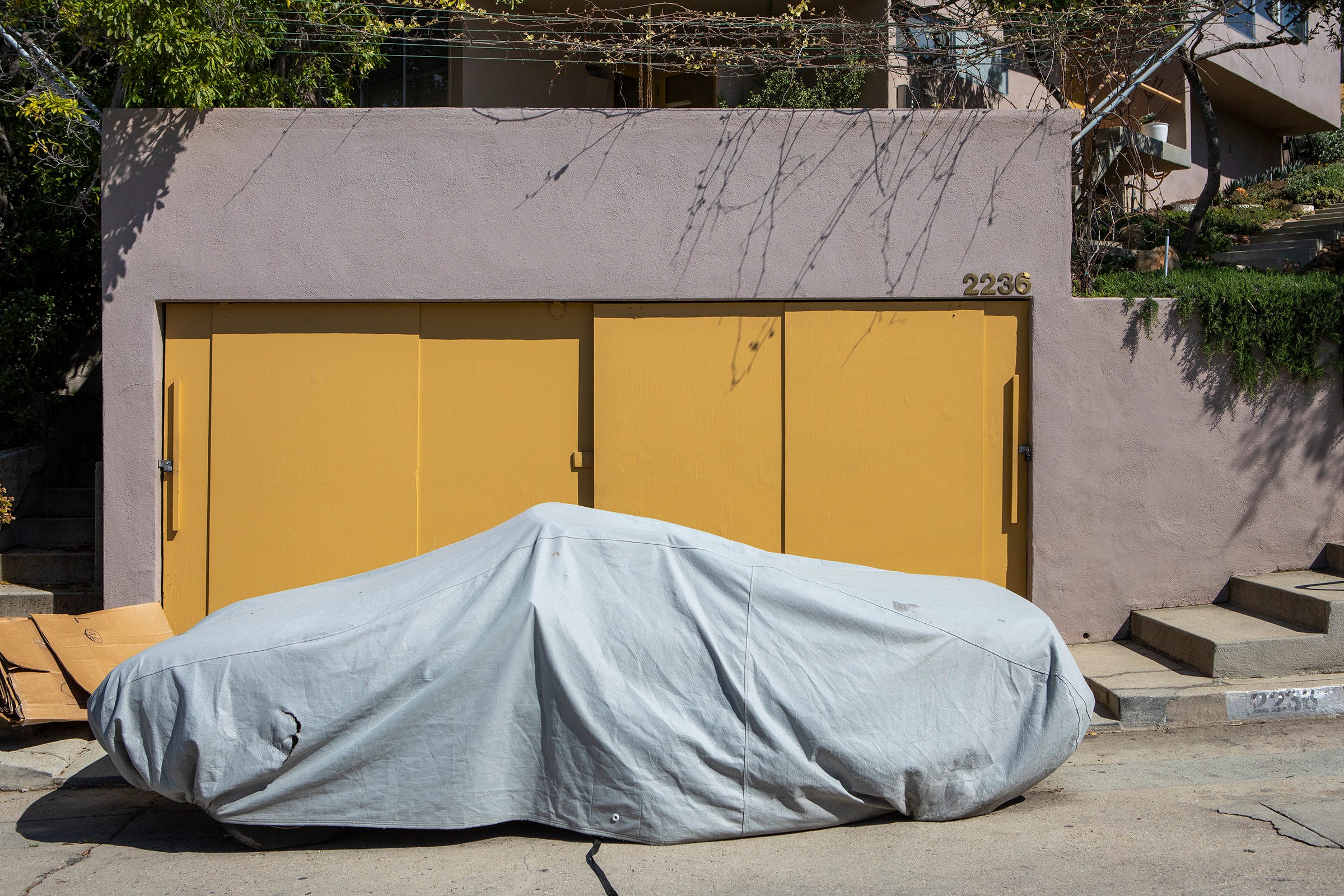
Photo two — Garage, address 2236, Los Angeles, color photograph.
The garage photograph works a related trick by different means. A tarp covers a car, patched with a visible tear. The tarp sits in front of two closed garage doors. The garage doors are a covering over whatever the garage holds. The whole arrangement sits inside a wall, which encloses a fourth thing you cannot see at all. Every surface in the image is a lid on something else. The one plain fact in the frame is the address, 2236, stenciled once on the wall and once on the curb, the single piece of information that is not hidden while everything else is sealed. What the photograph gives you, in the end, is a portrait of the owner made entirely of what has been covered up.
Both photographs come out of the same instinct, an unwillingness to summarize, an insistence on accounting for the whole visible surface of a thing instead of picking out the most photogenic part of it. That instinct shows up at a larger scale in Every Bridge Over the Los Angeles River, where Hill set out to photograph all 136 bridges crossing the river, not a representative sample, the whole set: cars, trains, footbridges, a natural gas pipeline; I think I saw one bridge built for horses. The river itself was paved into a concrete channel by the Army Corps of Engineers between the 1930s and the 1960s, and the bridges are what still cross it.
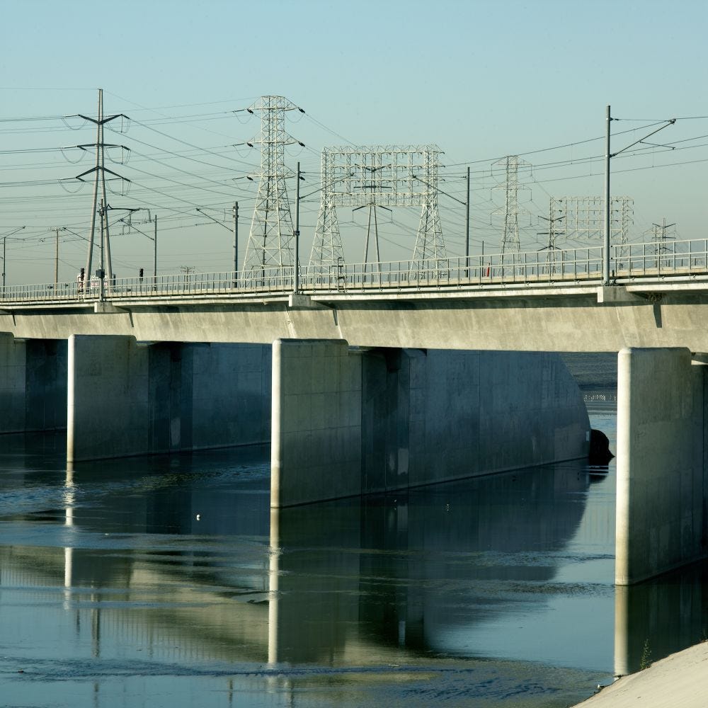
From Every Bridge on the Los Angeles River.
His other bodies of work move through Silver Lake, the San Gabriel Valley, Hollywood backlots, the arroyos, and decades of architectural photography for the Los Angeles Times Magazine and Architectural Record.
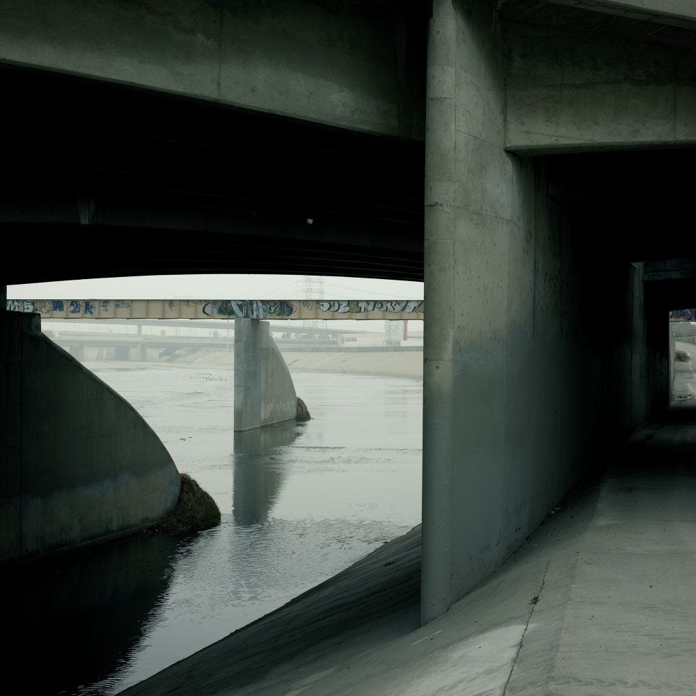
Another work for the series Every Bridge on the Los Angeles River. Every line, in just the right place.
Two websites hold it all. douglashillphotography.com carries the fine artwork and a print shop, signed editions of twenty, seventeen by twenty-two inches. doughill.com is the architectural and interiors side, the work that has paid the bills since 1969.
Sources on Olitski’s edge technique and Japanese-print cropping. If you're not familiar with those, take a moment to look and compare them to this work:
The Ukiyo-e Impulse: How Japanese Prints Shaped Degas’s Vision — Serenade Magazine
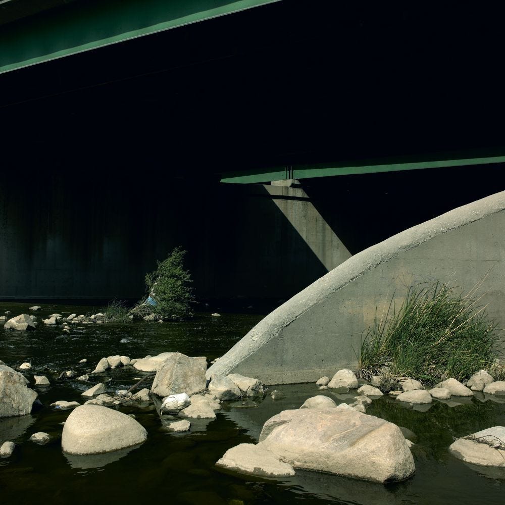
In the final image, simple shapes and a simple arrangement. Like a still life. Light touches of colour create a composition that plays man-made structures against the wisps of nature; I’m unsure if they struggle against each other, or work perfectly together. But every image makes me ask, “Would I have noticed that?”
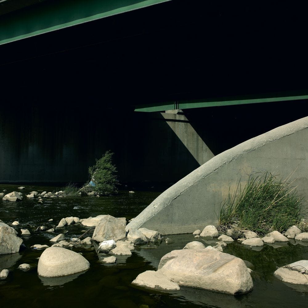

I keep coming back to that last image with the painterly strips of green, then it makes me want to look closer at the first one with the line of blue sky and red curb. Now I want to get out with my camera, thanks for the thoughtful analysis Jim.
Thanks so much for introducing Hill's work. There is a lot to learn from a study of Hill's work.