
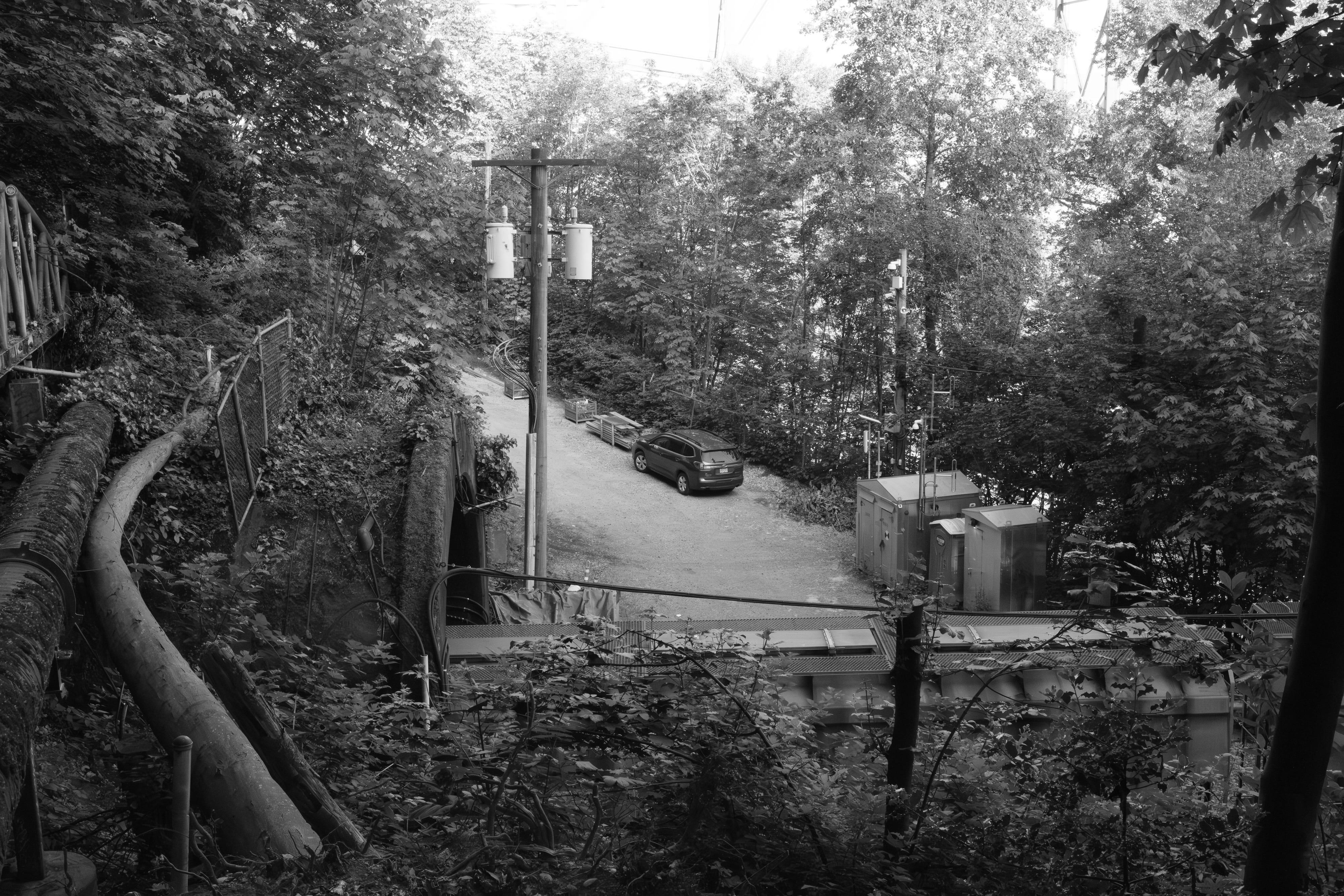
Before the Shutter
About my struggle with black and white photography

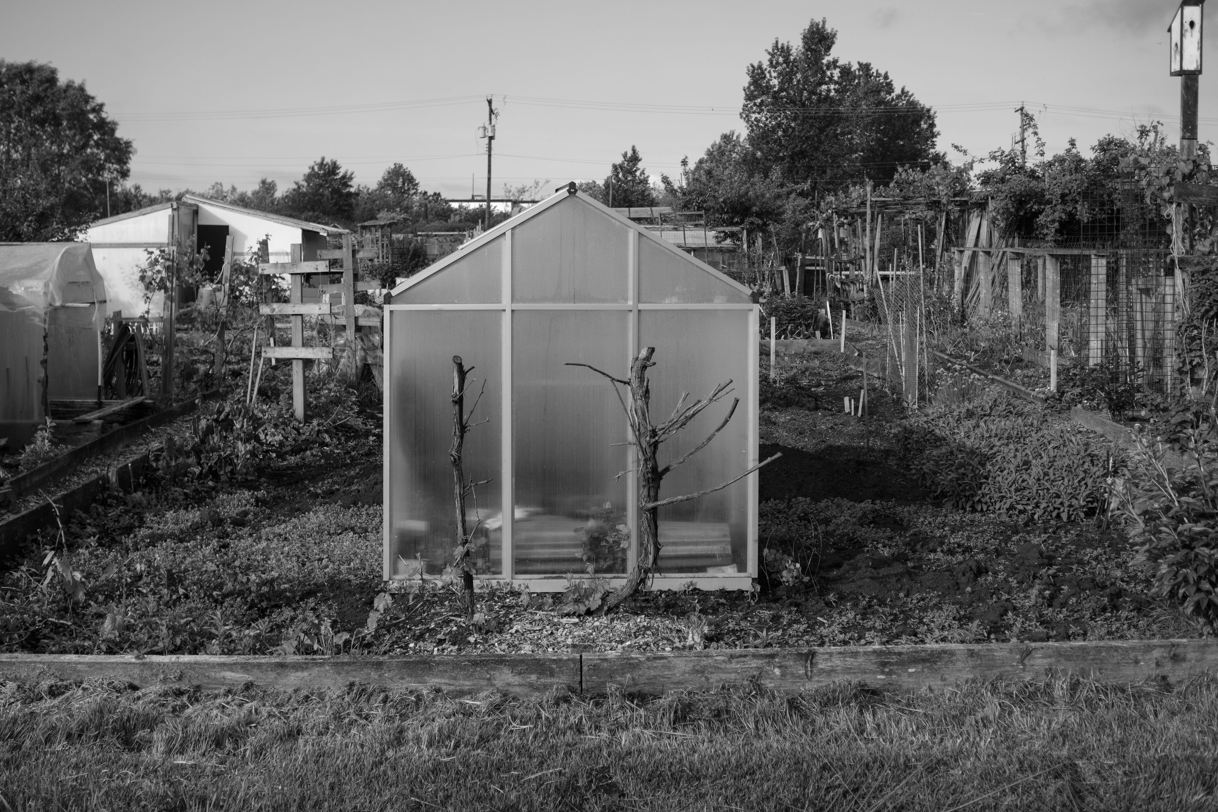
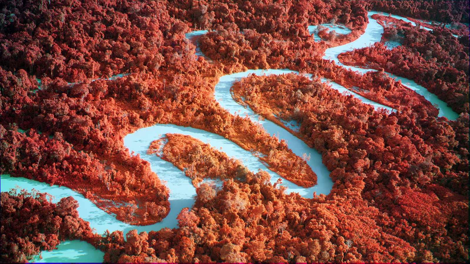
The black-and-white images are by the authors, and the colour images by Richard Mosse
The iPhone Moment
One of the first things iPhones did was provide the ability to make black and white photos on a colour camera at the touch of a button. This, in my view, was a genuinely damaging moment for photography as art. There was suddenly no truth to a photo anymore. There was no black and white film near the scene. There was no real camera taking the photo that we ended up looking at. There was little reason for the creation except to make one way of seeing subservient to another. You could press a button and change what you had taken to something else. And many people made the decision about which image to show their friends and family only after quickly, because it was all about immediacy, going through a wheel of choices. I have really grown tired of reading or hearing the word intent, but how else can you describe when the photo was taken except to say there was no intent?
Monochrome, Black and White, and Why It Matters
These days the terms monochrome and black-and-white are used interchangeably by most photographers, and that inconsistency is itself worth paying attention to. Monochrome is the broader term. It means any image rendered in a single color, or in the tonal range derived from a single color. Black and white is monochrome. Sepia is monochrome. Cyanotype is monochrome. An infrared print rendered in red tones is monochrome. And you could easily change the pink and red to baby blue, and it’s still monochrome. The term describes the visual result, not how you got there.
Black-and-white is technically a subset of monochrome, meaning an image rendered in tones ranging from black through grey to white, with no color information present. But in common usage the distinction is lost, and losing it has an impact, because it obscures a more important distinction: the distinction between process and result. My concern is that there seems to be very little connection between those anymore.
The first process is a black-and-white image made by a dedicated black-and-white sensor, a sensor with no color filter array, which records only luminance, shades of grey from a bright white to charcoal black, only brightness values, from the moment of capture. You're not going to be able to go back and separate two close colours. The Leica M Monochrome, oddly misnamed because it’s really a black-and-white sensor, not a monochrome one, is the best-known example. This sensor never sees color. It records the world in tones from the start. Every pixel carries a single, direct brightness value. Nothing is interpolated. This is something you study, and then forget, in your first year of art school. It might even be best to refer to this as dynamic range.
The second kind of photo is a color image, captured by a standard sensor that records red, green, and blue values for every pixel, which is then desaturated or converted in post-production to make a monochrome image. The color information was there, was recorded, and was then discarded. The tonal relationships in the final image are shaped entirely by how the software translates those color values into grey values. A red object and a green object that appear tonally identical to the eye may separate dramatically in conversion, or may flatten into the same grey, depending entirely on how the conversion is handled.
This is the bane of my attempts to take images in black and white, because even after years of looking at them, I have trouble translating them in my mind from one to the other. When I visit my printmaker, he just knows. I am amazed, and jealous of his skill. It’s always good to hire people whose skill level presses your jealousy button.
The clinical distinction is this: a true black and white photograph is one in which no color information was ever recorded. A converted photograph is a color photograph that has been rendered in greyscale. The visual results can be very close, particularly at low ISO in good light. But the process, and more importantly the intention at the moment of capture, are categorically different. This is why, on my Fuji camera, I don’t want to use the colour data, but am not just willing, but insistent on sticking to the crappy monochrome JPG I get, because only it is true to what I think I was taking. I don’t want an accidental photo. I want one I meant to take. And when I start fiddling with my colour data on the raw image, we are stepping into dangerous territory that only serves to demonstrate why I use a printer.
Well, let’s get out of this head-set; all you need to know is some people decide before they take a photo that it’s going to be black and white, and other people decide later. They see which out of all the many possible ways of rendering a photo they are going to use.
Borrowed Authority
Why does any of this matter? Black and white photography carries cultural weight it did not earn on its own. Put simply: black and white looks important. It looks serious. And because news came to us in black and white, black and white also looks true. Sorry, I’m actually just old enough to have seen newsreels at the movies. You, I suspect, are old enough to have seen movies of people at the movies watching newsreels. But you’re likely also infected.
I’m not the only one who thinks about this: Scott Strazzante, a San Francisco Chronicle photographer, put it directly in a 2014 PetaPixel piece: “There is a credibility and authenticity in the classic documentary black and white photography we all know from the FSA and Life Magazine photographers. I think it is ingrained in our psyche to trust and believe in these photographs. I think there is probably a sense of ‘import’ or ‘weight’ which black and white gets, sometimes intended, sometimes unintended. But much of that is cultural.” Strazzante says this understanding led him to stop converting his own work in post, because he felt some photo judges were being manipulated by that borrowed weight.
This is the problem with black and white used as what photographer Dina Litovsky calls “art sauce.” In a 2024 Substack essay, Litovsky argues that black and white is the most misused and overused of all photography devices, a band-aid applied to technical and conceptual problems, transforming a mediocre photograph into an aspirational one, “winking in the direction of ‘art.’” She adds a point about signature and style that is worth restating: “Many photographers are recognized by their color palettes. Turning those images black and white would make them indistinguishable from hundreds of other superficially similar photos.” And that reminds me of the VSCO era.
The Preset and the Person
There was, around 2014 to 2016, a young American photographer, I don’t remember his name, who built a very large following on YouTube. He had a car, then a van. He documented the van, the “fixing-up” of the van, the life lived in the van, and his nights couch-surfing. There were always beautiful young women, beautiful landscapes, painted canoes, campsites, perfect food, perfect light, and his long perfect hair, which he later cut, and there was lots of discussion about that choice. He used an app called VSCO to edit his photographs, and he made tutorial videos explaining how to achieve his look. The look was warm tones, faded highlights, a studied casualness that felt like discovery and freedom.
The problem was not him specifically. The problem was that he was interchangeable with a dozen other young, good-looking guys doing the same thing at the same time, and the photographs were interchangeable too. Same, same but different. The van, the hair, the young women, the campfire, the canoe, the Pacific Northwest light. You could swap one photographer for another and nobody would notice, because the aesthetic was the author. The person behind the camera had disappeared into the preset. Oh, and I forgot the socks. Everyone wore really, really nice socks. One hundred percent cotton. Thick and colourful. Campfire socks.
VSCO did to color photography what lazy black-and-white conversion does to monochrome. It provided a look that carried emotional and aesthetic weight borrowed from somewhere else, from film photography, from a certain idea of outdoor freedom and youth and beauty, and made that borrowed weight available to anyone with a phone and an app. The image did not have to earn the feeling. The filter supplied it.
The Spray-Can Caravaggio
The argument that easy tools damage art is not new. Charles Baudelaire made it in 1859, when photography itself was the easy tool. He argued that photography was the refuge of failed painters, that by flattering people into thinking mechanical reproduction was art, it was corrupting public taste and debasing the very idea of what art was. He was wrong about photography, but he was right about the mechanism: easy access to a tool that produces aesthetically pleasing results without demanding the development of vision tends to flood the space with work that looks like art without being art.
I described this to a friend: what if there were a paint you could spray on a canvas, or a coat you could apply afterward, and suddenly it looked like a Caravaggio? That is the problem. That is why everyone with a camera is suddenly an artist. Yes, and I am a bit worried my black-and-white images are spray-can photos….a bit. And I’m trying to think my way out of that.
What Caravaggio had was not just technical skill, though the technical skill was extraordinary. What he had was a way of seeing, a decision about where the light should fall and what that light should mean, a theology of darkness and illumination worked out over years of looking and thinking and failing. The chiaroscuro is not a technique applied to the painting. It is the argument the painting is making. You cannot spray that on.
The damage operates on two levels. The first is the flooding of visual culture with images that look serious without being serious, which makes it harder to see the ones that are. The second is more insidious: the ease of the tool removes the necessity of developing vision in the first place. If you can achieve a pleasing result without learning to see, you will never learn to see. I fear that! And if you do not learn to see, you will never make the images that could not have been made any other way, which are the only images that matter.

When Process Is the Argument
None of this is an argument against black and white, or against monochrome, or against manipulation. The argument is against process chosen without necessity, without intention, without the image demanding it. The counter-evidence is important and should be held alongside the complaint. I feel the goal is not to make black-and-white images, but to make images that have to be black-and-white…that’s my goal. If I can make the image another way I feel I am wasting my time. Stick to colour.
I have friends who make monochrome images that are beautiful and serious, and they are clearly not using black-and-white as sauce. They are using it because color would lose something, because the tonal relationships, the contrast, the texture, the structure of light in the image, are what the image is actually about. Foliage, for instance, is where manipulating the image, separating two different channels of green into two different greys, makes sense in a way that has nothing to do with nostalgia, or misplaced authority, and everything to do with what the eye actually saw.
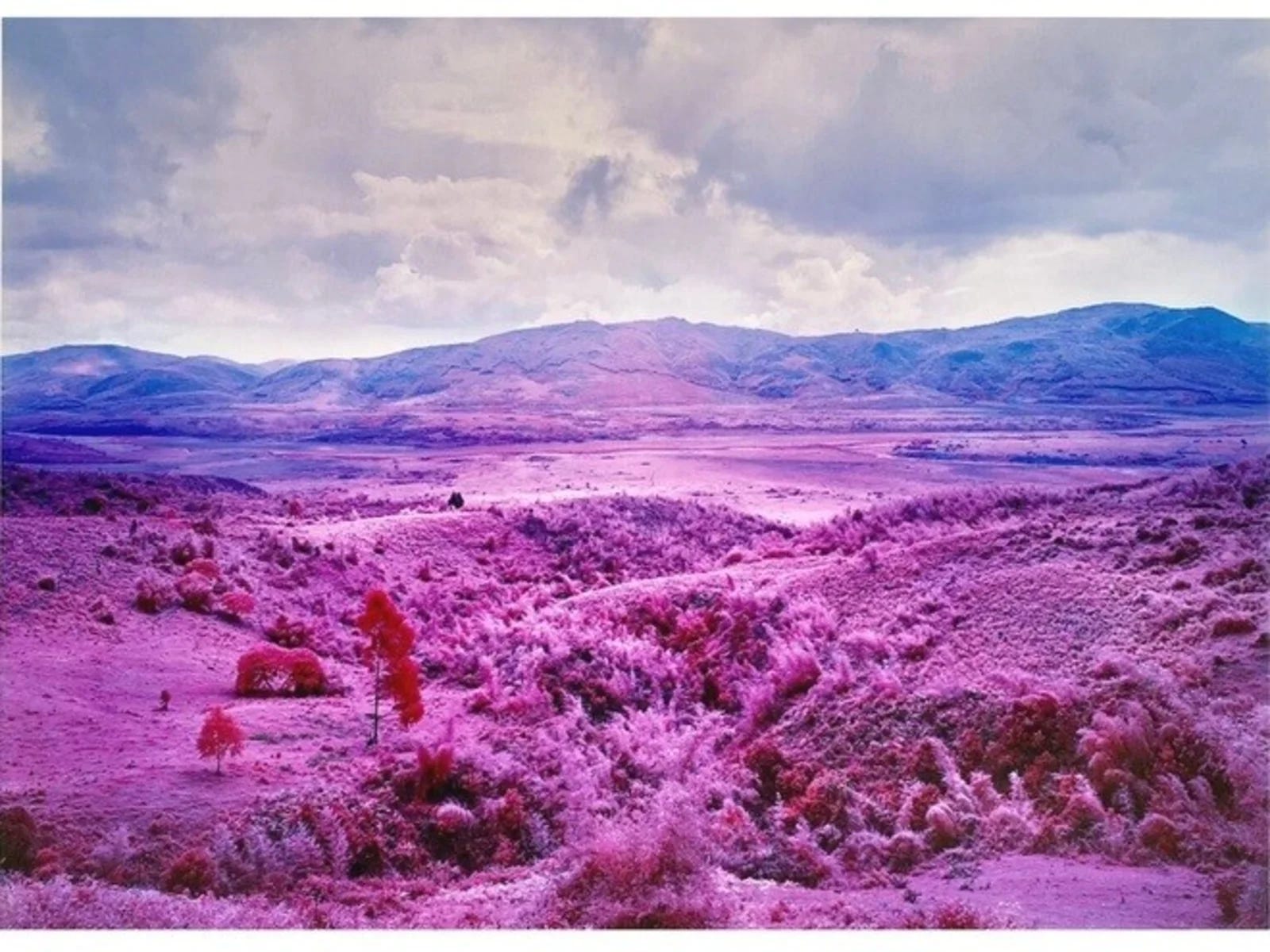
The photographer Richard Mosse is a good example of process as argument. Mosse photographs conflict zones, most famously in the Democratic Republic of Congo, using infrared film, and later infrared digital capture, which renders green vegetation in vivid pinks and magentas. The color is not decorative. It is a deliberate act of defamiliarization. He is making the landscape of war look alien, because he believes the conventional documentary photograph of conflict has become so familiar that it no longer registers. The viewer has seen too many grey-green jungle photographs of suffering. The infrared image stops that habituation. It forces the viewer to see the landscape, and the people in it, as strange, as something that should not exist. The manipulation is the argument.
Remove the infrared from Mosse and you do not have a simpler version of the same work. You have no work. That is the test. Could this image exist, as this argument, in any other form? If the answer is no, the process is necessary. If the answer is yes, the process is decoration.
Sebastiao Salgado, who works exclusively in black and white, explains his choice in terms that are the opposite of nostalgia. He distrusted color because it pulled his attention away from his subject: “I never see this red in my life. Color itself was a kind of lie. It was a huge exaggeration. When I saw my color picture, I was much more interested in the color than in the personality or dignity of the person.” That is not borrowed authority. That is a decision in service of the subject.
Sally Mann’s use of wet-plate collodion, a nineteenth century process, is another example. She lets dust accumulate on the plates, mixes dirt and debris into the water, and often chooses a plate that suffers from light leaks over a technically perfect one. From the outside, this can look like the pursuit of character through artefact, exactly the creative crutch McLochlainn warns against. But Mann has said in an interview that the skill is knowing when to stop. That single sentence separates her from every photographer who mistakes manipulation for vision. I was looking last week at a print of hers owned by someone here in town. The image was so overexposed that I had to wait, and keep looking, before it came together visually. It was worth the wait. The overexposure was not a flaw I was forgiving. It was the experience of the image. Mann knew when to stop. She stopped there.
The Nostalgia Problem
The most philosophically precise account of the nostalgia problem in photography comes from Ailbiona McLochlainn, a photographer and former research psychologist, writing in 35mmc in 2022. She argues that nostalgia for the analogue era has produced a fundamental confusion: “We have come to associate the look of old, usually amateur and technically flawed photos, with soul and character. But the vintage look of an image and the soulfulness of its subject matter are two separate things.”
Her specific target is the belief that technically limited or vintage equipment produces more characterful images. She calls equipment-related artefacts, grain, vignetting, lens flare, excessive bokeh, a creative crutch: “Relying on artefacts for ‘character’ results in dated-looking photographs rather than characterful photographs.” And she makes the historical point that the photographers we now consider masters of the analogue era were not celebrating their equipment’s limitations: “Professional photographers who worked in the analogue era did not revel in the technical limitations of their equipment, but rather tried to overcome them.”
This framework maps directly onto the black-and-white problem. The grain, the faded tones, the desaturated conversion, these are artefacts being used as character. The soulfulness they appear to carry belongs to the photographs they are imitating, not to the photographs they are.
Before the Shutter
The choice of tools leads you down one of many paths. Some of these paths are massively creative. Some are nostalgic. Some are destructive, not to photography as a whole, which will survive, but to the photographer’s own development of vision, which may not recover if the tool does the seeing for long enough.
The path toward serious photography is not closed, and it does not require a Leica M Monochrome or a special sensor or expensive equipment. It requires one decision, made before the shutter and not after: what am I trying to say, and is this process the right way to say it? If the process is chosen first, as the argument, the image has a chance of being necessary. If the process is chosen last, as the finish, the image is decoration.
References
Dina Litovsky, “My Favorite Black and White Photographers Working Today,” Substack, August 2024. https://dinalitovsky.substack.com/p/my-favorite-black-and-white-photographers
Allen Murabayashi, “Is Black and White Photography a Gimmick?” PetaPixel, November 2014. https://petapixel.com/2014/11/13/black-white-photography-gimmick/
Ailbiona McLochlainn, “Photographic Nostalgia and the Myth of Soulfulness,” 35mmc, January 2022. https://www.35mmc.com/18/01/2022/photographic-nostalgia-and-the-myth-of-soulfulness-by-ailbiona-mclocklainn/
Charles Baudelaire, “The Salon of 1859.” Available in translation in various Baudelaire essay collections.
Richard Mosse: www.richardmosse.com. See The Enclave (2013) and Incoming (2017).
The most helpful thing you can do for me is Re-Stack my essays. Please, also join the conversation with comments and your ideas.

I’m so glad you write these pieces because you are able to put to eloquently put to words the half baked notions swirling around my head. I’m weary of the proclamations about black and white’s innate nobility or the purity of film.
It’s artifice posing as art. My intention is not to create the next viral image; rather it is to render the thing with the respect for which it deserves. Success rests on whether the final image retains nuances of that something I saw in the moment.
I have been out with my camera and forced my seeing, believing that by looking from a different perspective is enough to impart to a viewer the necessity of observation. Sometimes those experiments look cool however they are almost always closed images. There it is with nowhere to go.
Thank you for making the reasoned argument since my attempt would more resemble “man yells at cloud.”
This is a wonderful article, Jim. It certainly looks at issues of B&W and Monochrome images in photography, in ways I have not thought of before. So many good talking points, but one analogy really stood out for me. I've been reading, Secret Knowledge, rediscovering the lost techniques of Old Masters, by David Hockney (who sadly passed away a couple of days ago).
Hockney has Caravaggio down as the first "director of talent" in front of a camera! Yes, a lens was used to outline the compositions, and the dark rooms, contrast and brightness, it could be argued (and Hockeny does) are artifacts of what was required by the (secret) technology of the day to make the projections, to outline the image. Was Caravaggio a great painter? Absolutely!!! But his drafting skills it seems (and many others - that's Hockney's argument) were augmented by optical tools, according to Hockney.
I bring this up because although there is a lot of good factual information in your article. Some of it just seems like nitpicking. To change the way B&W film "saw" the world... one used colour filters on the the front of the camera so the light was filtered differently (the wavelength changed), to change the contrast. There was no other choice - if you were shooting B&W. In many ways, "art sauce" or not, I find many of these distinctions, desaturated, or physically rendered on a digital sensor (is that possible) or actual film, almost a form of infighting. Time will decide what's art and what is mere artifice, should the work be lucky enough to survive that long.
These ideas are important and well worth thinking about. Then, it might be worth considering that if it looks like a duck and quacks like a duck, it probably is still a duck! I used to consider my self to be a B&W film shooting and B&W printing specialist in the 1980s. Today I am more than happy to take advantage of the wonderful flexibility of digital photography, by delving into the menu system of my Nikons, and setting the camera to B&W when I want a B&W image, and still have a colour file to re-render a B&W from later if I want to.
Sally Mann certainly sums it up well, it's all process (art process) and whatever you do it's important to know when to stop.
I look forward to reading more comments from other photographers on this important subject. Great article.